ShopDreamUp AI ArtDreamUp
Deviation Actions
Suggested Deviants
Suggested Collections
You Might Like…
Featured in Groups
Description
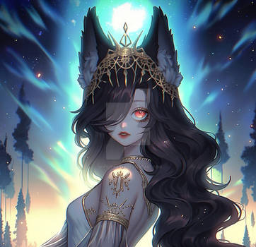
Contest entry for Voleno 
Her game character Cassanna Estierre.
First I'd like to say that I REALLY LOVE her design. When I saw the character height reference, my eyes were almost instantly drawn to her and then in her infos I read "Element(s): Darkness and wind" DAMN GAL SAY NO MORE KJDSJHFA I might even make fan arts of her if college doesn't eat up all my time haha//
This was one of my (very few) paintings that just flows smoothly; it's like I could already picture this image inside my head lol I looove twin blades! <33
I hope everyone enjoys this as much as I do!!
---
Cassanna © Voleno
Art © mintdesu
---
Painting process gif:
:origin()/pre13/a2ff/th/pre/f/2016/263/a/1/queen_of_darkness_painting_process_by_mintdesu-daib0aa.jpg)
---
Recent works:
:origin()/pre15/347f/th/pre/i/2016/265/e/d/you_wanna_know_about_my_past__by_mintdesu-daiek3d.jpg)
:origin()/pre12/640a/th/pre/i/2016/255/3/9/don_t_underestimate_espers_by_mintdesu-dah8k75.jpg)
:origin()/pre11/5aa7/th/pre/i/2016/258/e/8/ce__gysking1_by_mintdesu-dagf0gp.jpg)
:origin()/pre11/efab/th/pre/i/2016/206/1/5/kings_by_mintdesu-dabb8de.jpg)
:origin()/pre08/d65b/th/pre/i/2016/230/3/c/daisuki_club_artbook_by_mintdesu-daecjtl.jpg)
Her game character Cassanna Estierre.
First I'd like to say that I REALLY LOVE her design. When I saw the character height reference, my eyes were almost instantly drawn to her and then in her infos I read "Element(s): Darkness and wind" DAMN GAL SAY NO MORE KJDSJHFA I might even make fan arts of her if college doesn't eat up all my time haha//
This was one of my (very few) paintings that just flows smoothly; it's like I could already picture this image inside my head lol I looove twin blades! <33
I hope everyone enjoys this as much as I do!!
---
Cassanna © Voleno
Art © mintdesu
---
Painting process gif:
:origin()/pre13/a2ff/th/pre/f/2016/263/a/1/queen_of_darkness_painting_process_by_mintdesu-daib0aa.jpg)
---
Recent works:
:origin()/pre15/347f/th/pre/i/2016/265/e/d/you_wanna_know_about_my_past__by_mintdesu-daiek3d.jpg)
:origin()/pre12/640a/th/pre/i/2016/255/3/9/don_t_underestimate_espers_by_mintdesu-dah8k75.jpg)
:origin()/pre11/5aa7/th/pre/i/2016/258/e/8/ce__gysking1_by_mintdesu-dagf0gp.jpg)
:origin()/pre11/efab/th/pre/i/2016/206/1/5/kings_by_mintdesu-dabb8de.jpg)
:origin()/pre08/d65b/th/pre/i/2016/230/3/c/daisuki_club_artbook_by_mintdesu-daecjtl.jpg)
Image size
2200x3111px 4.27 MB
© 2016 - 2024 mi-nt
Comments22
Join the community to add your comment. Already a deviant? Log In
*inhales* let's do this.
I have to start by saying this is one of my favourite entries for this contest, and definetly the one that left the most impact on me, making a character I hadn't originally payed that much attention shine so brightly.
The lighting is on point, the brush strokes are rough but not messy, more detailed in areas of focus such as her face, hair, and upper body part, the shading adds texture to the different types of surfaces, the expression fits with the character and composition and there's barely any noticeable mistake in the whole drawing. (But I'm here to point out some mistakes, even if I myself wouldn't be able to do any better on canvas.)
When it comes to drawing in perspective, anatomy can get tricky - but have no fear, my friend! You have done a wonderful job in overcoming that and posing the subject correctly. However, there are two minor mistakes in angles:
1. On her left hand, the angle of her hand and the angle of her sword don't allign, making the sword handle look slightly wrongly bent over there
2. Her right leg and foot (to confirm this, I almost fell in front of the mirror;<img src="e.deviantart.net/emoticons/w/w…" width="15" height="15" alt="
Now, moving on to deviantart's criteria~!
Vision: everything fits. there's nothing more to add there. well done!
Originality: the reason i didn't score this with 5 stars is because both her legs' position and her swords' position are often used. the reson i gave 4,5 is that the angle, color theme, lighting and effects on this drawing make all of that seem unique.
Technique: purple and red are one of the hardest combination of colors to work with, in my opinion. make a mistake in toning and it will look slightly bothering - yet you've made them get along so well, the usual conflict i find between them doesn't even stand out here. the reason i took one star away is, other than the angle mistakes i've pointed out above, the outline of the drawing standing out on some parts and missing on others (on the lower part of the pants the lines aren't so well blended in, while on her hat they're almost non-existent), and the volume of her left sword's handle and guard.
Impact: i immediately noticed this among the other entries, and i think that in itself calls for 5 stars of impact - my satisfaction when i clicked and zoomed in for quality only adds to it.
Overall, you've caught this character on canvas in a way not many artists could proudly say they could, and I have to admire you for that. Well done!
Phew~ That was all :3 I've written more than I ever did for any of my school English assignments, omg-- but I couldn't help it, since I loved this enough to come back to it T-T Graycchi outt~~~


![[Prize] Kyarameee](https://images-wixmp-ed30a86b8c4ca887773594c2.wixmp.com/f/0ca23117-ff19-4fb7-8731-5a33dafa4af2/d930kng-3885e654-69cb-436e-808d-7eb5253d446c.jpg/v1/crop/w_92,h_92,x_0,y_8,scl_0.046,q_70,strp/_prize__kyarameee_by_mi_nt_d930kng-92s.jpg?token=eyJ0eXAiOiJKV1QiLCJhbGciOiJIUzI1NiJ9.eyJzdWIiOiJ1cm46YXBwOjdlMGQxODg5ODIyNjQzNzNhNWYwZDQxNWVhMGQyNmUwIiwiaXNzIjoidXJuOmFwcDo3ZTBkMTg4OTgyMjY0MzczYTVmMGQ0MTVlYTBkMjZlMCIsIm9iaiI6W1t7ImhlaWdodCI6Ijw9MTcyMCIsInBhdGgiOiJcL2ZcLzBjYTIzMTE3LWZmMTktNGZiNy04NzMxLTVhMzNkYWZhNGFmMlwvZDkzMGtuZy0zODg1ZTY1NC02OWNiLTQzNmUtODA4ZC03ZWI1MjUzZDQ0NmMuanBnIiwid2lkdGgiOiI8PTEyODAifV1dLCJhdWQiOlsidXJuOnNlcnZpY2U6aW1hZ2Uub3BlcmF0aW9ucyJdfQ.39FzQqh8xLuHH7Gfh2oeT54q-Uly6edEO9jm8O7ExH0)


![[CE] Inner peace](https://images-wixmp-ed30a86b8c4ca887773594c2.wixmp.com/f/0ca23117-ff19-4fb7-8731-5a33dafa4af2/datx383-3ab90d96-5ffc-4628-83bf-16798d1e856e.jpg/v1/crop/w_92,h_92,x_13,y_0,scl_0.037096774193548,q_70,strp/_ce__inner_peace_by_mi_nt_datx383-92s.jpg?token=eyJ0eXAiOiJKV1QiLCJhbGciOiJIUzI1NiJ9.eyJzdWIiOiJ1cm46YXBwOjdlMGQxODg5ODIyNjQzNzNhNWYwZDQxNWVhMGQyNmUwIiwiaXNzIjoidXJuOmFwcDo3ZTBkMTg4OTgyMjY0MzczYTVmMGQ0MTVlYTBkMjZlMCIsIm9iaiI6W1t7ImhlaWdodCI6Ijw9MTAyMyIsInBhdGgiOiJcL2ZcLzBjYTIzMTE3LWZmMTktNGZiNy04NzMxLTVhMzNkYWZhNGFmMlwvZGF0eDM4My0zYWI5MGQ5Ni01ZmZjLTQ2MjgtODNiZi0xNjc5OGQxZTg1NmUuanBnIiwid2lkdGgiOiI8PTE2MDAifV1dLCJhdWQiOlsidXJuOnNlcnZpY2U6aW1hZ2Uub3BlcmF0aW9ucyJdfQ.Pzq95ET99kqF2ECo-Q116nMB2uDkojgfL-l1E6Ybucc)


![Ain Thaumturge [Elsword]](https://images-wixmp-ed30a86b8c4ca887773594c2.wixmp.com/f/2e6c5a0e-098d-48ca-832e-2049b3552068/dat3hc3-b81689d1-b000-40f4-96ce-23acecc5293c.png/v1/crop/w_184)
![The White Priest [lobotomy corp x elsword]](https://images-wixmp-ed30a86b8c4ca887773594c2.wixmp.com/f/29606688-38df-477f-b011-668d355f274d/dca39si-00988740-803a-4815-adf1-d690b9625010.png/v1/crop/w_184)


![[Request] Mitra](https://images-wixmp-ed30a86b8c4ca887773594c2.wixmp.com/f/7ed6aa9d-4346-402e-bf94-4754f8f97400/dairoww-8ec227dc-6fac-444c-a252-f4cada1a1001.png/v1/crop/w_184)


![[Collab] Flowing Colors](https://images-wixmp-ed30a86b8c4ca887773594c2.wixmp.com/f/e9a41d85-c8da-4054-87a0-5db4f337847c/d9zq36b-cb506d62-958f-4aee-a12d-eb2dc88bf7ea.png/v1/crop/w_184)